|
|
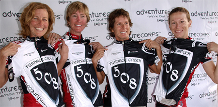
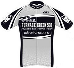
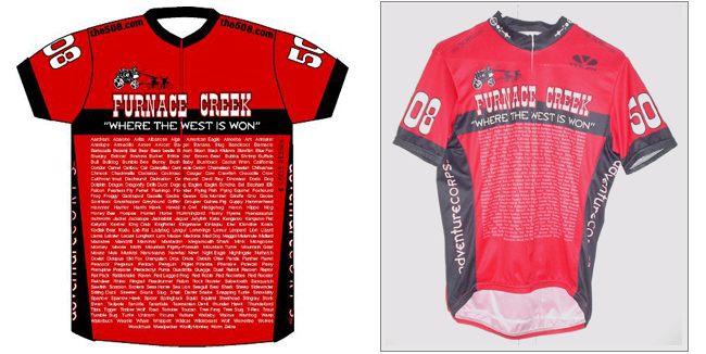
The 508 Jersey
Only official finishers of "The Toughest 48 Hours in Sport" are awarded, and may wear, the exclusive Silver State 508 / Furnace Creek 508 cycling jersey. Above, L-R: Team Hammer Frogs, solo men's champ Chris Ram Ragsdale, and mens' runner-up Michael Alpine Ibex Emde in 2009.
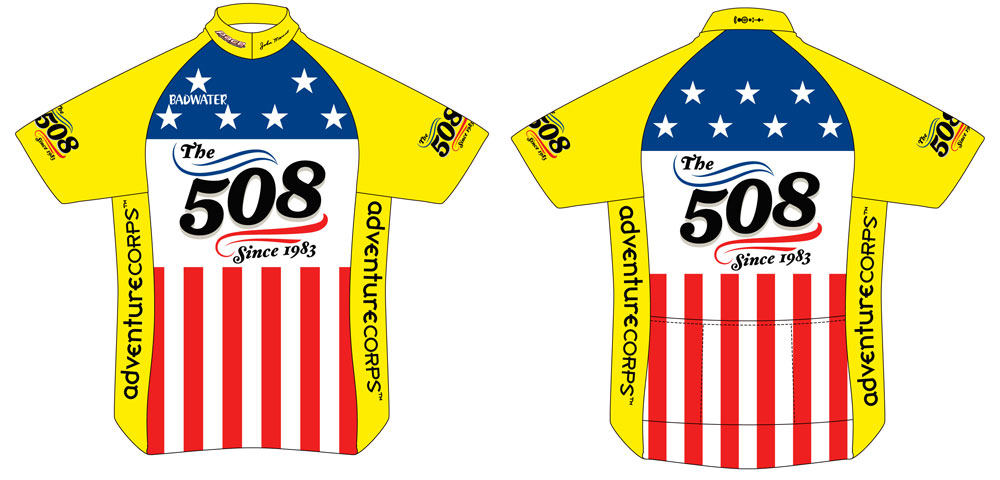
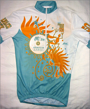
2016 Finisher Jersey
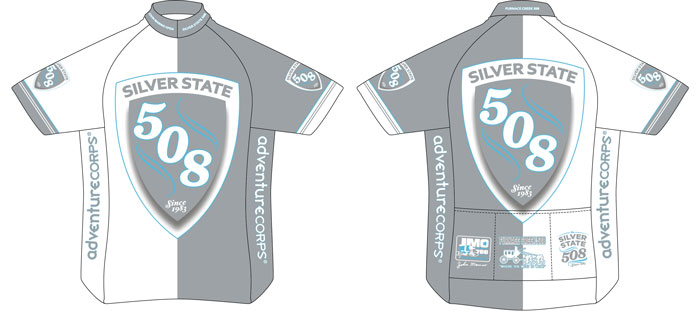
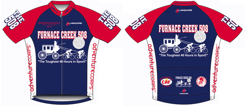
In 2016 we circled back to the extremely popular jersey design we used in 2009, 2010, and 2012, except in silver to denote the race's new name and location - Nevada, the Silver State! We also tipped our hat to the race's history dating back to 1983 by including the John Marino Open logo (1983-1990) and Furnace Creek 508 logo (1991-2013) on the left and middle rear pockets, as well as all three race historic race names on the collar. The race has been held in four widely different venues since it was founded in 1983, but the essence of the race remains the same: epic mountain climbs, stark desert scenery, desolate roads, and the race's reputation as one of the toughest but most gratifying endurance challenges available, bar none!
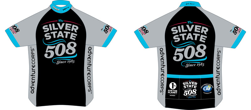
2015 Finisher Jersey
Sometimes simple is powerful, so in 2015 we simply swapped out a few colors from 2014 and - Bingo! - we had an awesome new design!
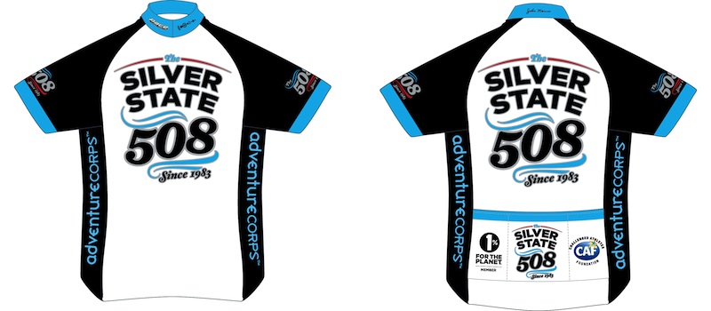
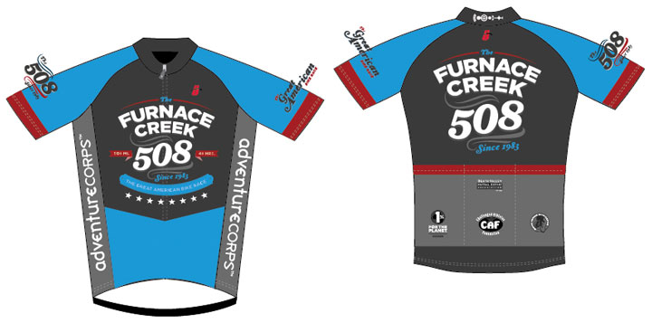
2014 Finisher Jersey
In 2014 we moved this iconic, historic race to the "Silver State," Nevada. As such, we tasked Marcus Edvalson with updating his 2011 redesign to reflect the new landscape of the race.
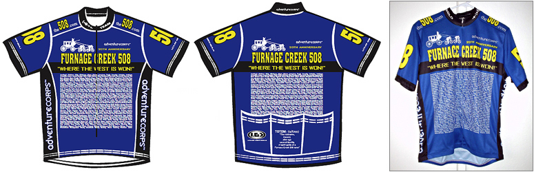
2013 Finisher Jersey
For 2013, the thirtieth anniversary of the race, we updated the 2001 jersey (which was based upon Jonathan Boyer's RAAM 1985 jersey) and, of course, had it produced by PACE Sportswear.
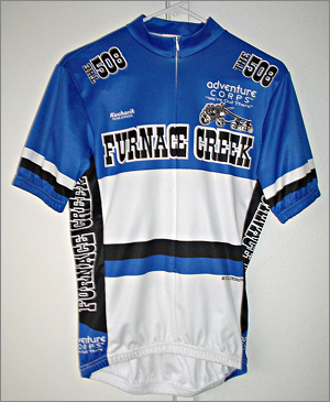
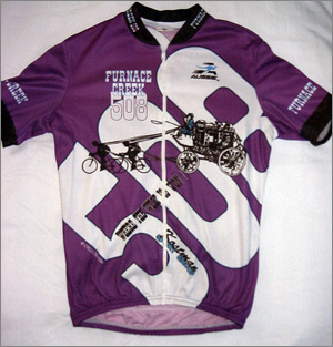
2012 Finisher Jersey
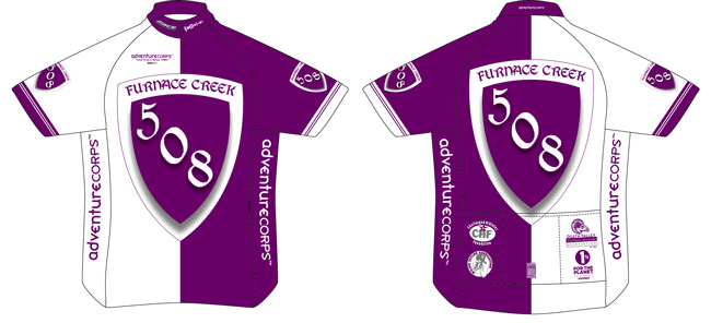
In 2012 we also excitedly brought PACE Sportswear back on board to produce our official finisher jerseys and other cycling apparel! This brought us back to our roots as PACE produced the jerseys for this event from 1984 through 1994, but also now our garments are Made In The USA and sourced locally, from southern California! We had Pace produce a royal purple version of the super popular design from 2009 and 2010.
2011 Finisher Jersey
The 2011 jersey was deisgned by Marcus Edvalson, a veteran rider and staffer of AdventureCORPS events who is a brand and identity expert, art director, and very accomplished graphic artist. The jersey features the entire suite of new Furnace Creek 508 logos (note the difference between the front and back of the jersey, as well as the shoulder logos) which Marcus also created. Bravo, Marcus, and onward and upward, 508 and 508ers! More about Marcus.
2010 Finisher Jersey
The 2009 jersey was so popular, looked so good, and so well reflected the spirit of The 508, we brought it back in a different color combo in 2010. Again, as I've always seen ultra sports as a modern day quest, we wanted to hark back to the days of the knights and chivalry with the shield graphic. Produced by Hincapie Sports.
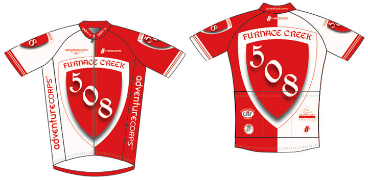
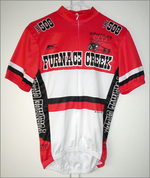
2009 Finisher Jersey
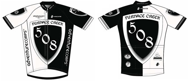
We were a little bit influenced by the Swiss National Team jersey for this design, but more than anything, as I've always seen ultra sports as a modern day quest, we wanted to hark back to the days of the knights and chivalry with the shield graphic. Coincidentally, black and white is very "in" these days. Produced by Hincapie Sports.
2008 Finisher Jersey
For our 25th anniversary, we wanted something really classic and timeless. This was also the first time that the new race slogan - "The Toughest 48 Hours in Sport" - was featured on the jersey. This ties with 2001 as my all-time favorite 508 jersey. Produced by Hincapie Sports.
2007 Finisher Jersey
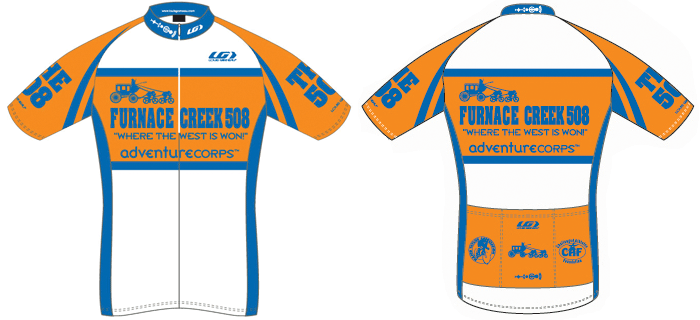
We'd hever had orange in the mix, so we tried that as a high-visibility, and hopefully unique, approach in 2007. Produced by Louis Garneau.
2006 Finisher Jersey
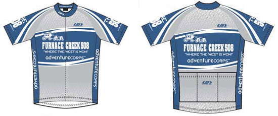 
I was at a loss to dream up a new design for 2006, so I used a stock Louis Garneau design with logos added into the mix. It came out quite nicely, but by chance was a bit reminiscent of the Discovery Channel Team jersey that year. We also made an aternate "Veteran" edition that year, shown at right, for veterans racers from previous years who wanted a new jersey. Produced by Louis Garneau.
2005 Finisher Jersey
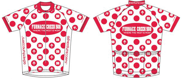
 A few people have asked about the logo inside some of the dots in the polka dot design (as well as on the back of the 2005 508 hat and very small on the back of the 2005 508 shirt). I was inspired to use it because of its French connections (as we were knocking off the TdF's polka dot jersey design this year), because it was used by the Free French Air Force during WWII, and because it was the "team ring" symbol from Magnum, PI (worn by all the guys from Tom Selleck's Magnum character's Viet Nam unit). Way back when, it was used by the Knights Templar and more recently a simple version of it is used as the American Lung Association logo, an organization for which I used to work as an event promoter. To me, all of those uses represent "fighting the good fight" and that’s why I think it’s a good motif for the 508, an event I like to refer to as “heaven on earth” and “a spiritual odyssey.” Ultimately, though, the beauty of any symbol is that its meaning is entirely up to its observer. Click here regarding the Magnum PI connection (which sounds corny, I suppose, but it means a lot to me). Produced by Louis Garneau. A few people have asked about the logo inside some of the dots in the polka dot design (as well as on the back of the 2005 508 hat and very small on the back of the 2005 508 shirt). I was inspired to use it because of its French connections (as we were knocking off the TdF's polka dot jersey design this year), because it was used by the Free French Air Force during WWII, and because it was the "team ring" symbol from Magnum, PI (worn by all the guys from Tom Selleck's Magnum character's Viet Nam unit). Way back when, it was used by the Knights Templar and more recently a simple version of it is used as the American Lung Association logo, an organization for which I used to work as an event promoter. To me, all of those uses represent "fighting the good fight" and that’s why I think it’s a good motif for the 508, an event I like to refer to as “heaven on earth” and “a spiritual odyssey.” Ultimately, though, the beauty of any symbol is that its meaning is entirely up to its observer. Click here regarding the Magnum PI connection (which sounds corny, I suppose, but it means a lot to me). Produced by Louis Garneau.
2004 Finisher Jersey
This jersey harked back to the 2001 jersey, without being quite so "All-American" in style. Produced by Louis Garneau.
2003 Finisher Jersey
As in 2002, this jersey featured all the totems which had been utilized at Furnace Creek 508, from their first use in 1993 through the 2003 editions. Produced by Louis Garneau.
2002 Finisher Jersey
This jersey featured all the totems which had been utilized at Furnace Creek 508, from their first use in 1993 through the 2002 editions. We went back to the red, black, and white color combo of 1999, but with much less white. Produced by Voler.
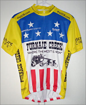 |
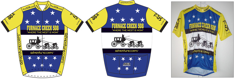
2001 Finisher Jersey
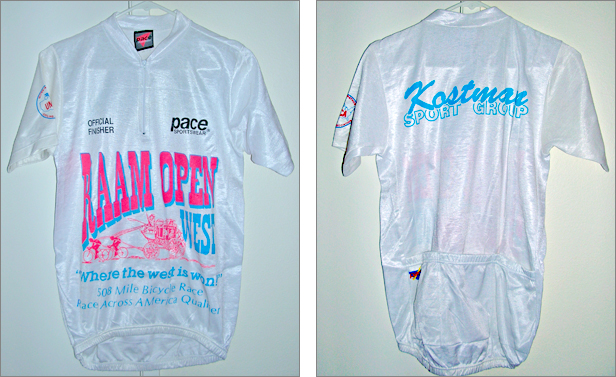
This design was a knock-off of the jersey worn by Jonathan Boyer during the 1985 Race Across America. I (Chris Kostman) was the RAAM Race Official "in charge of" Boyer during that race. As such, I drove along in a car for nine days from Huntington Beach to Atlantic City, watching Boyer, a Tour de France professional, compete in a dark duel with ultracycling legend Michael Secrest. Boyer's jersey had the same stars and stripes motif, with yellow accents. Produced by Kucharilk.
|
 |
2000 Finisher Jersey
This was identical to the 1999 jersey, except blue, white, and black, instead of red, white, and black. I loved the 1999 jersey, so we "recycled" the art. Nobody else knew this, until now, but I was tipping my hat to Lon Haldeman with this color combination, as these were Lon's colors in his 1982 Great American Bike Race and 1983 Race Across America victories. Produced by Kucharilk.
|
 |
1999 Finisher Jersey
This jersey was the first which I really designed myself. It was an almost identical knock-off the Bridgestone Cycles USA jersey which I received when I sponsored by Bridgestone in 1992-1994. When I send a vest version of this jersey to Grant Petersen, who had run Bridgestone back then, he laughed and told me that he had knocked off the Cilo cycling team jersey from Switzerland when he designed the Bridgestone jersey. I also chose these colors because red, white, and black, were always RAAM legend Michael Secrest's colors. Secrest won the original 508 in 1983, then known as the John Marino Open. Produced by Kucharilk.
|
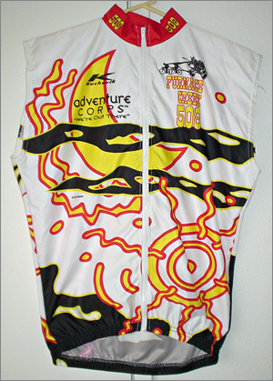 |
1998 Finisher Jersey (vest version shown)
Designed by Bev Schutte, an artist specializing in art for the cycling industory. It has various ultra racing elements, such as the sun and moon. Produced by Kucharilk.
|
 |
1997 Finisher Jersey
Designed by Bev Schutte, an artist specializing in art for the cycling industory. It has various desert elements, such as the sun, fire, and desert animals. This was the first 508 jersey to feature "AdventureCORPS" as our company name. Produced by Kucharilk.
|
 |
1995 and 1996 Finisher Jersey
Designed by Bev Schutte, an artist specializing in art for the cycling industory. If I recall correctly, the giant "508" text was my idea, and of course the stage coach pulled by cyclists was our logo from the beginning in 1990. The 1996 edition was almost identical; the only difference was the briefly used company name (and corresponding logo) "Chris Kostman Adventure Group." Produced by Aussie.
|
1994 Finisher Jersey
Prouced by PACE Sportswear. This was the last year we used a silk-screened jersey, before we went to the "fully sublimated" style which allows "warp around" art and a much better look and appearance. This jersey featured our company icon for the first time, as well as similar icons on the back. More on that.
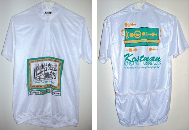
1993 Finisher Jersey
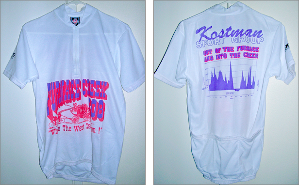
We were still stuck using silk-screening. The slogan on the back, also featured on the t-shirt from that year, was something that popped into my head one day, an alternate of "out of the frying pan and into the fire." Produced by PACE Sportswear.
1992 Finisher Jersey
From the beginning of the race in 1983 through 1994, we were using silk-screening to place the art on the jersey. This not only meant the jersey had to be primarily one color, it also meant the art would be effectively pushed down the chest by the length of the zipper. We did the best we could with th technology of the day. Produced by PACE Sportswear, as was the jersey in all previous years.
|